Menu

Constructing the
Social Self

Painting with Data

About

In today’s heightened digital age, the collection and availability of data has surpassed any level encountered before. With this increase in information comes the importance of how it is both distributed and displayed to audiences, especially considering the widespread presence of social media. Utilizing image search code and personal data sets from social networking platforms, this exhibition of paintings explores the relationship between visual design and systems of data. Through recurrent themes exposed in the compilation of reports, three distinct series of location, app activity, and connections emerged in the work. As a whole, these sets unite to provide a revealing look into the volume of personal data captured on the internet as well as how these statistics can be reclaimed into aesthetic representations of the self. The investigation of the synergy linking the artistic and digital fields opens a view into how data can influence the creative process and if through adopting this innovative lens, the presented information can take a more humanized form. This study leaves the mind to wonder, can artificial data truly capture a cohesive and authentic image of an individual?


Historical and Modern Context

Placing the Social Self in a History of Abstraction and Today

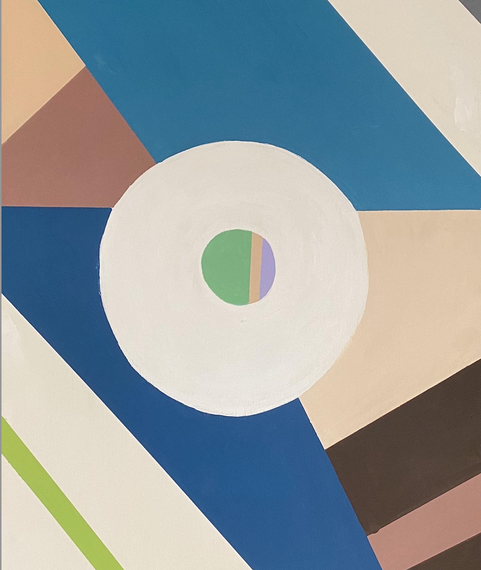
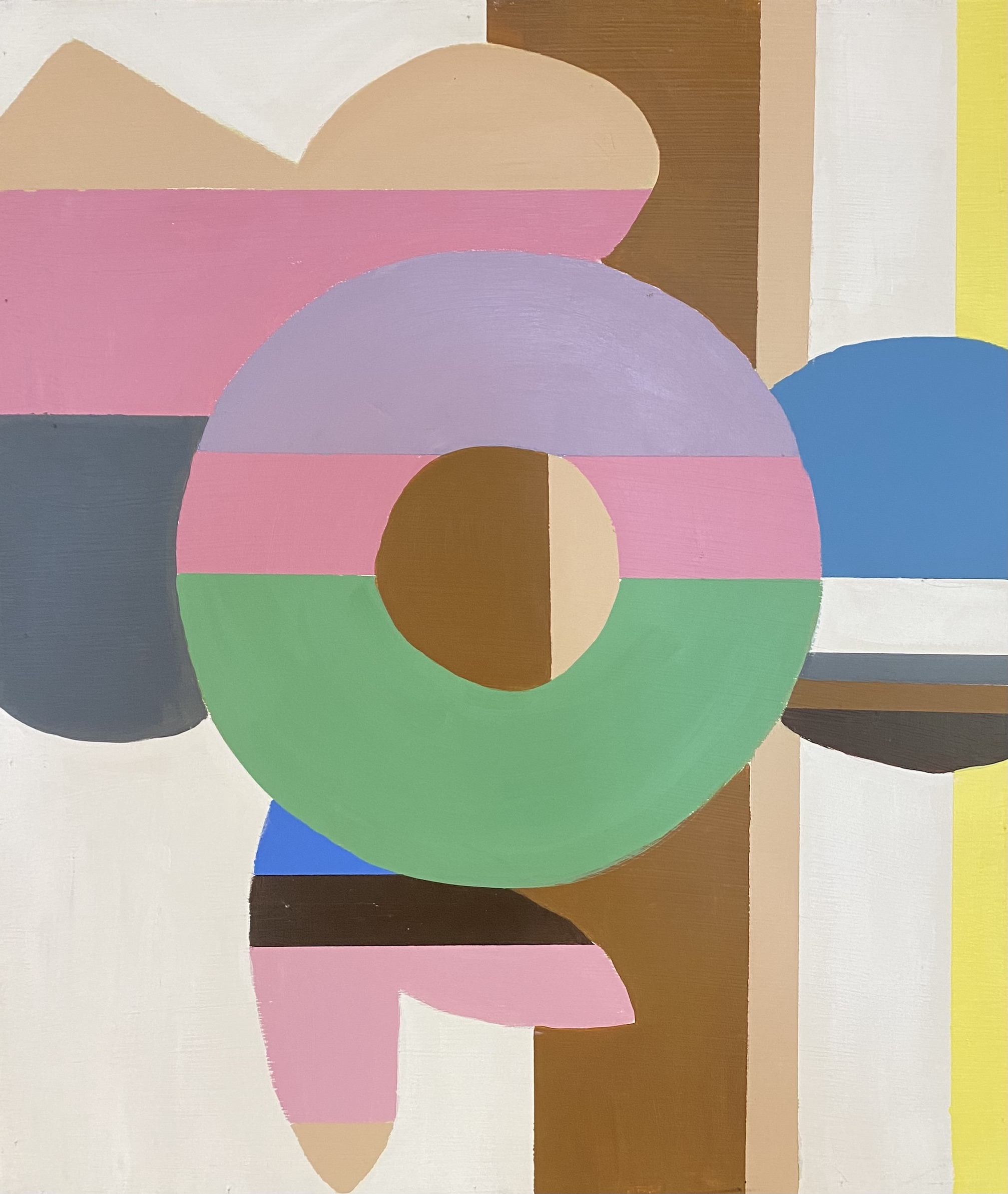
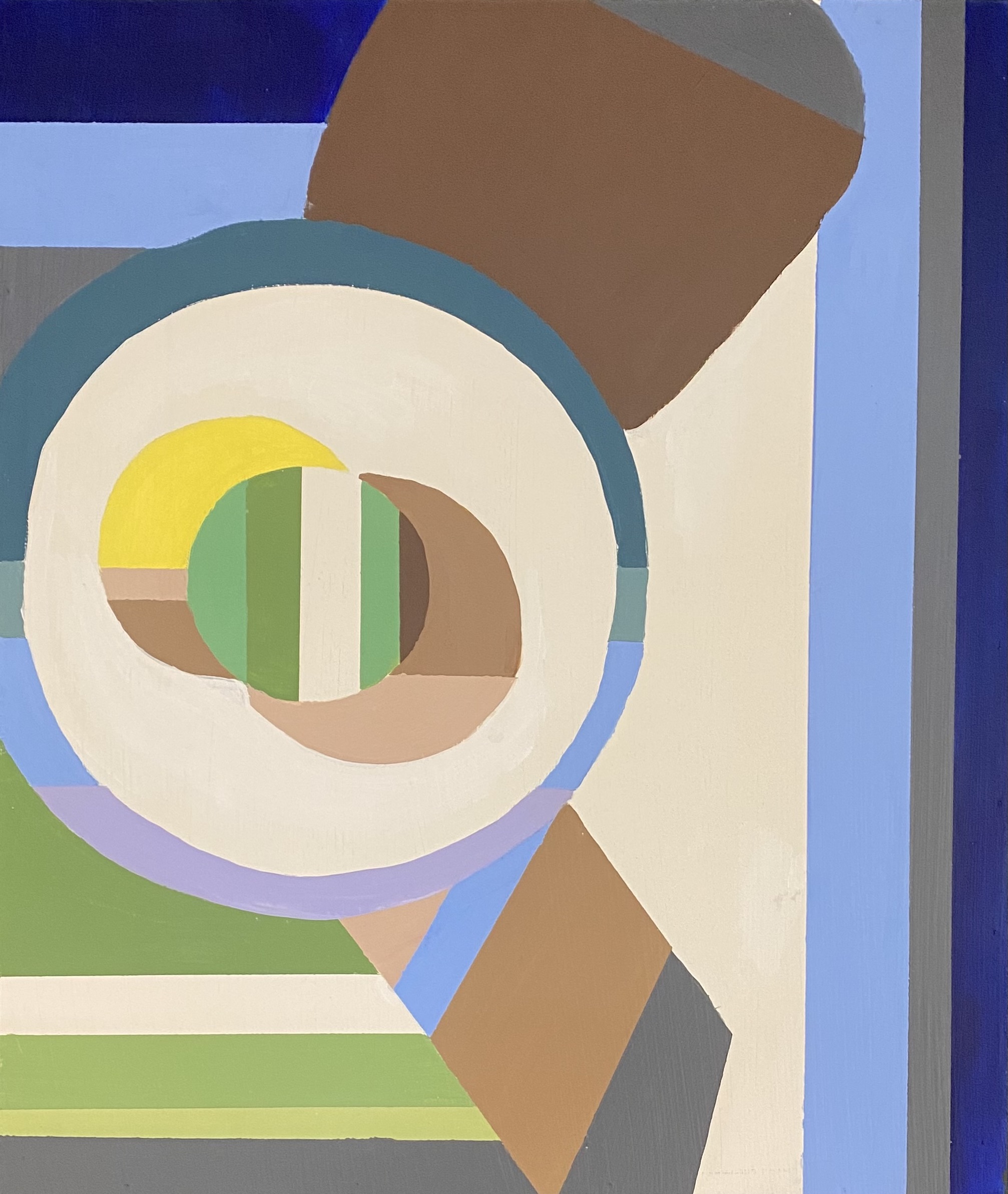
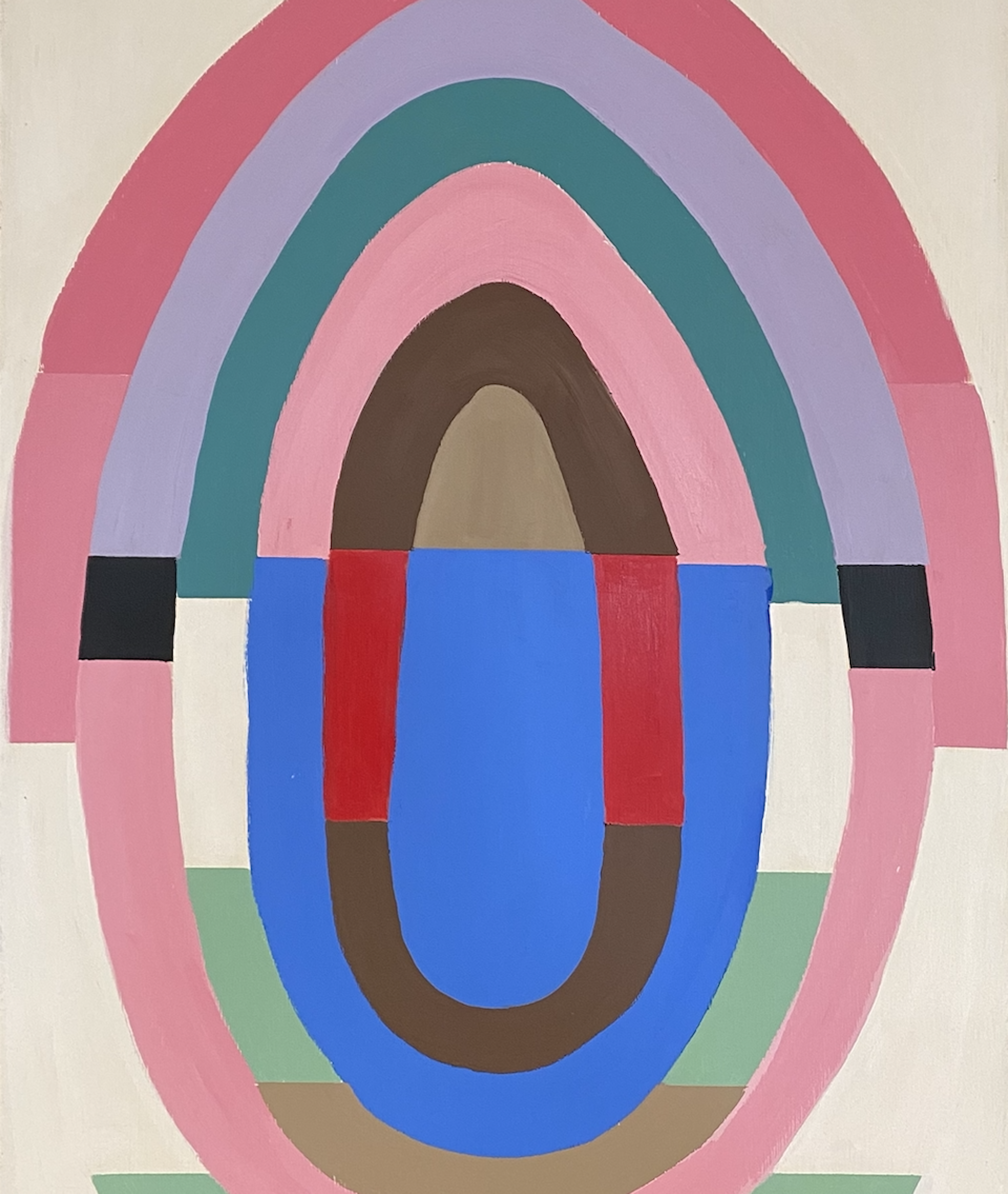
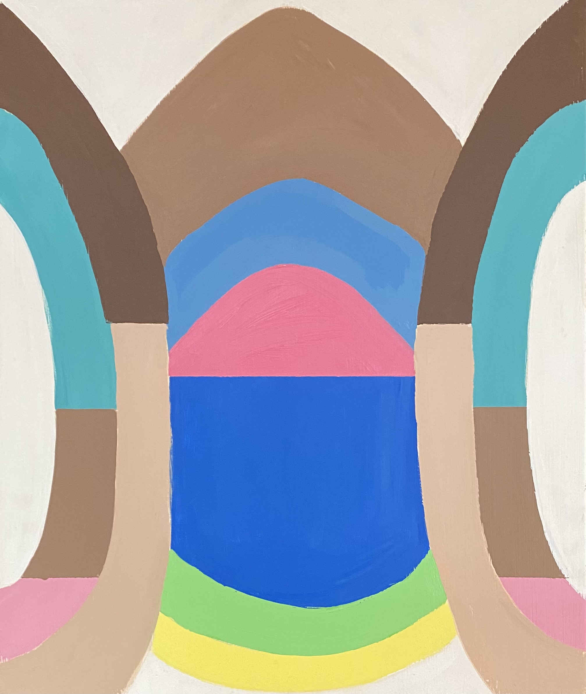
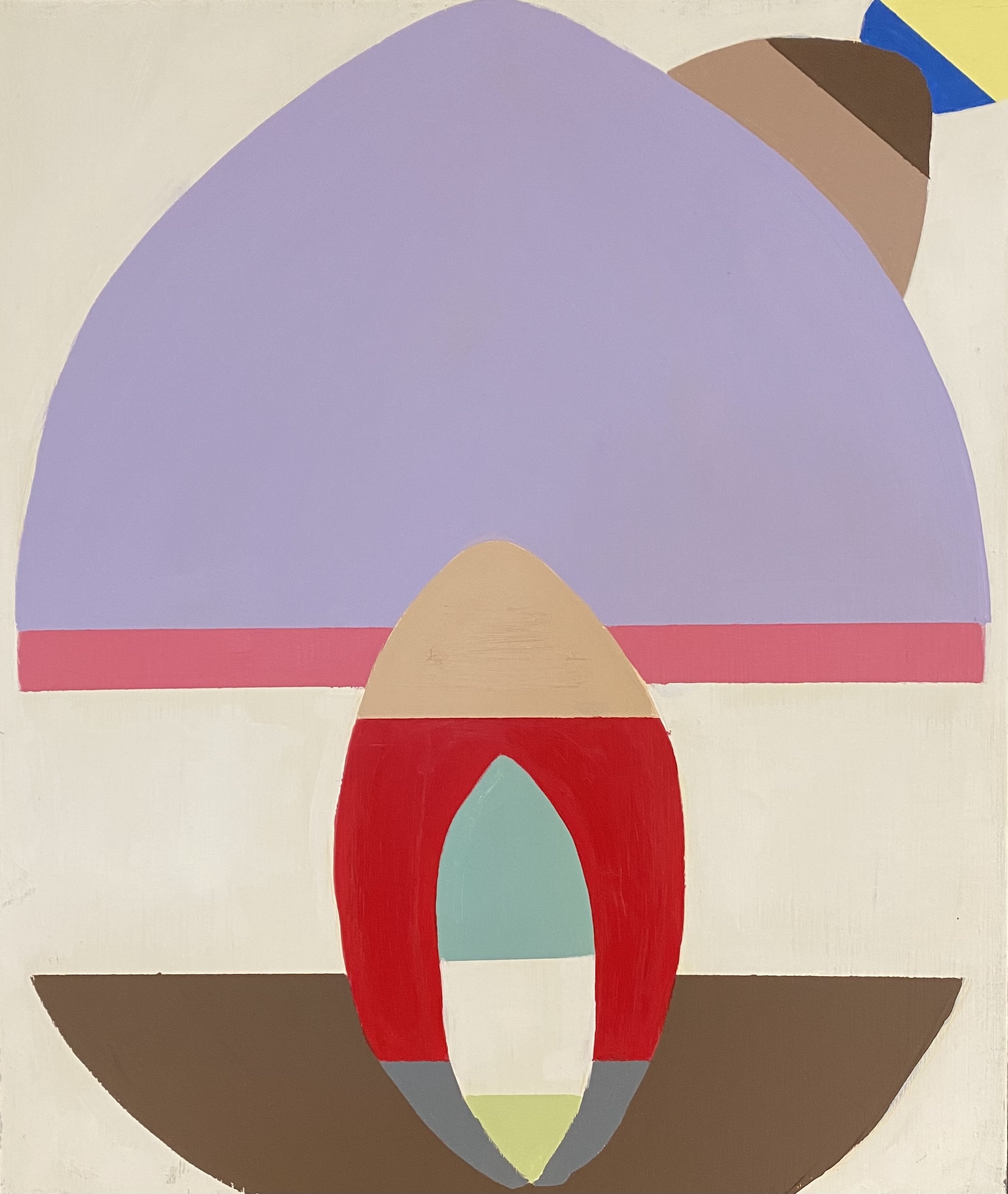
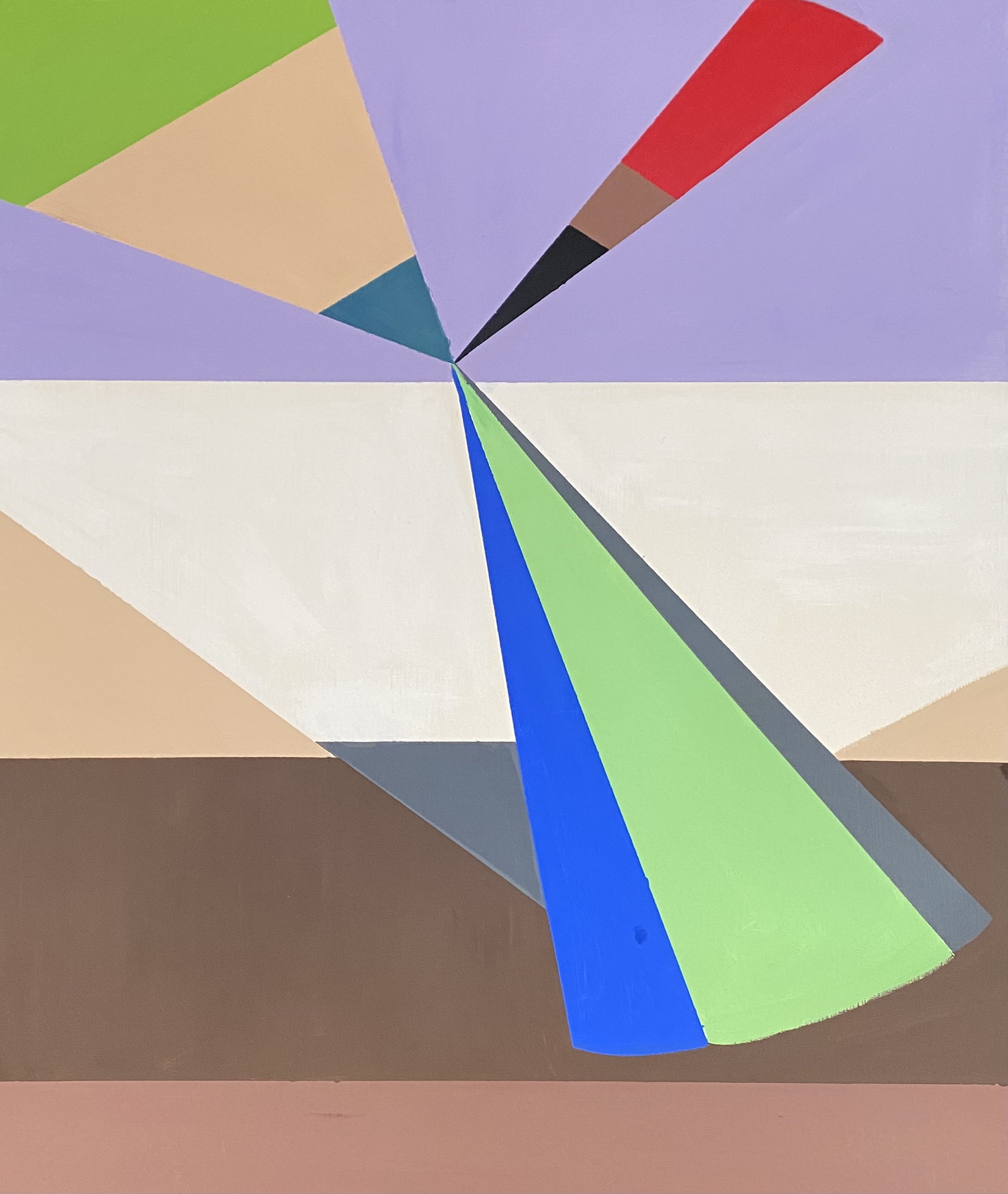
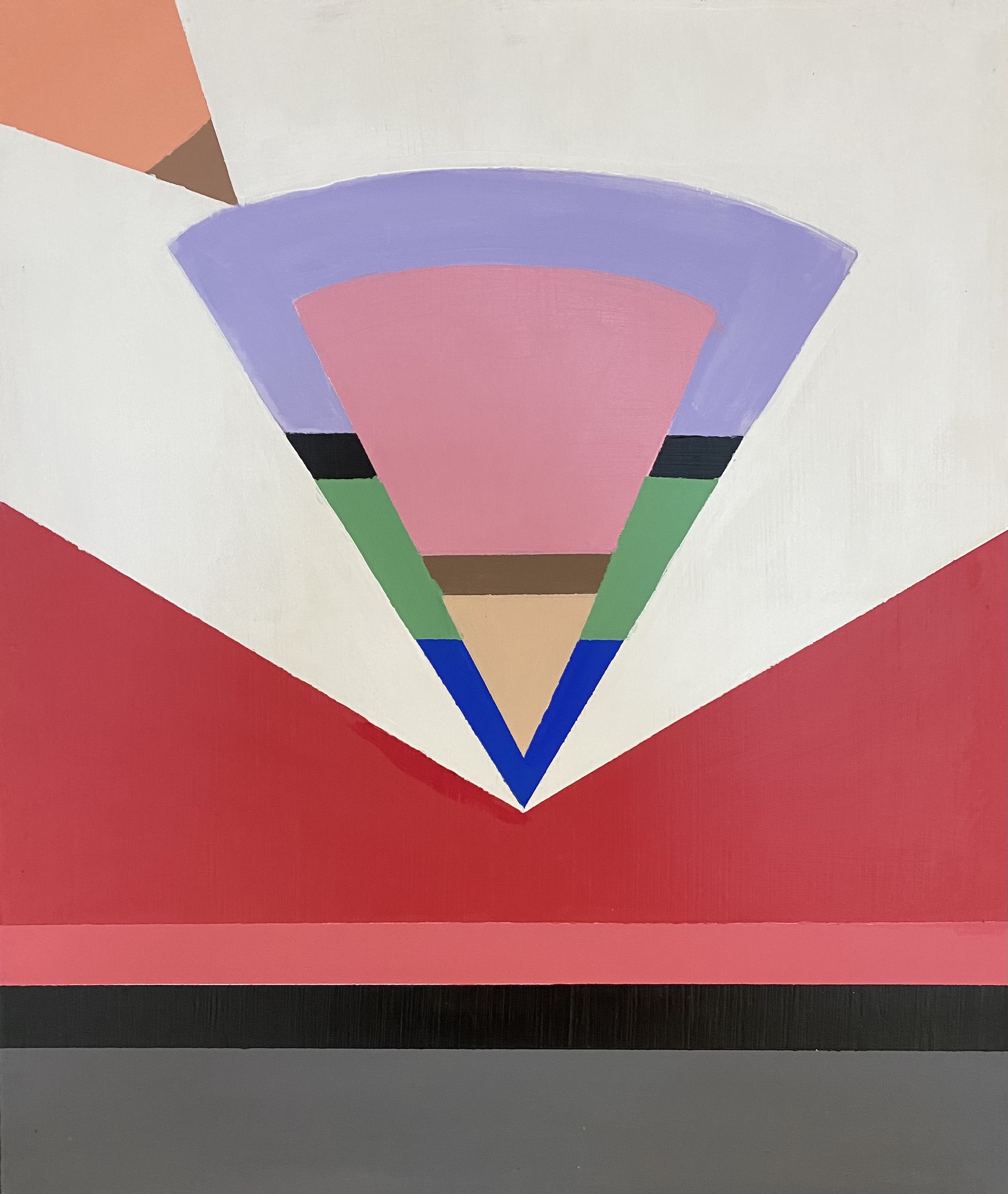
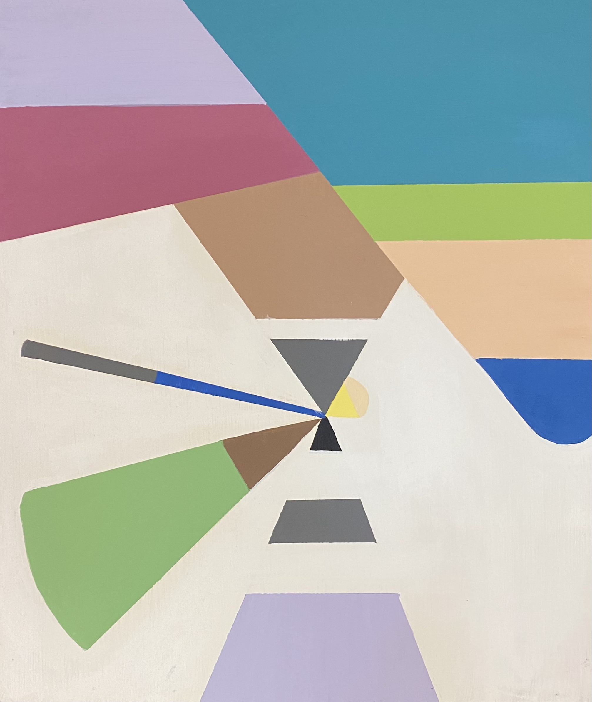
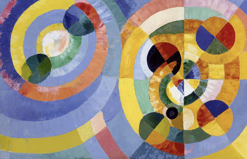
In the history of abstraction, geometric representations and symbolic forms have shown themselves as key components of expressing spirituality and deeper meaning. This aspect of abstraction can especially be seen in the 19th and 20th centuries when an emphasis was placed on simple, reduced forms to convey spiritual ideas in connection with visual imagery. Artists of this period were intrigued by the ability of art to connect with other human senses and perceptions, such as music and emotion. By viewing the human experience through the lens of the soul and environmental vibrations, the formal qualities of color and form developed into crucial focal points of abstract works during this movement. This idea of cosmic imagery can be seen in various compositions within the references to concentric circles, triangles, and mandalas. The incorporation of these forms calls back to mystical concepts related to the oneness of the universe, the existence of paired-opposites for each entity, and the emphasis on the realness of imagination. Due to the complex and otherworldly nature of these ideas, symbols and geometrical forms became prominent ways to visually communicate these perspectives. For instance, one example of this relationship is the thought of the presence of an eternal center of life which often found itself being illustrated in terms of the circle. Furthermore, the ideas of duality and paired-opposites were layered into this imagery through overlapping groups of circular forms that worked together as a system. One artist who particularly highlights these ideals is Robert Delaunay, a French painter of the 20th century. By the end of his artistic career, Delaunay leaned into abstraction fully by creating paintings focused on the interconnection between geometry and color. Delaunay’s paintings communicated ideas related to the cosmic importance of shape through his usage of circular forms and contrasting colors, which emphasized the synergy between the two qualities as a compelling connection to the qualities of symbolism.

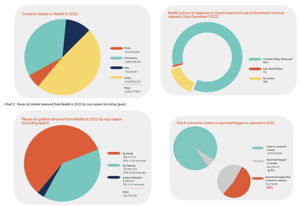
Fast forward almost a century later and these types of compositions can still be found not just in the art world but also in the technological sphere of society. Entering into the world of data visualizations and ever-increasing data collections, typical representations of information take shape in similar formats. For example, in Reddit’s 2022 Annual Report, several of the company’s visually documented statistics appear extremely similar in nature to works such as Delaunay’s. The idea of the pie chart, which incorporates both the form of the circle and the triangle, creates a reference to this ideology about geometry in visualizations that was present in the world of abstract art. Although the representations are in much different contexts, it is intriguing to see how the two communicate to each other through a shared language of color and form. This fact is interesting to consider knowing that these types of graphs were also used in data visualization during the time period of pieces such as Delaunay's.

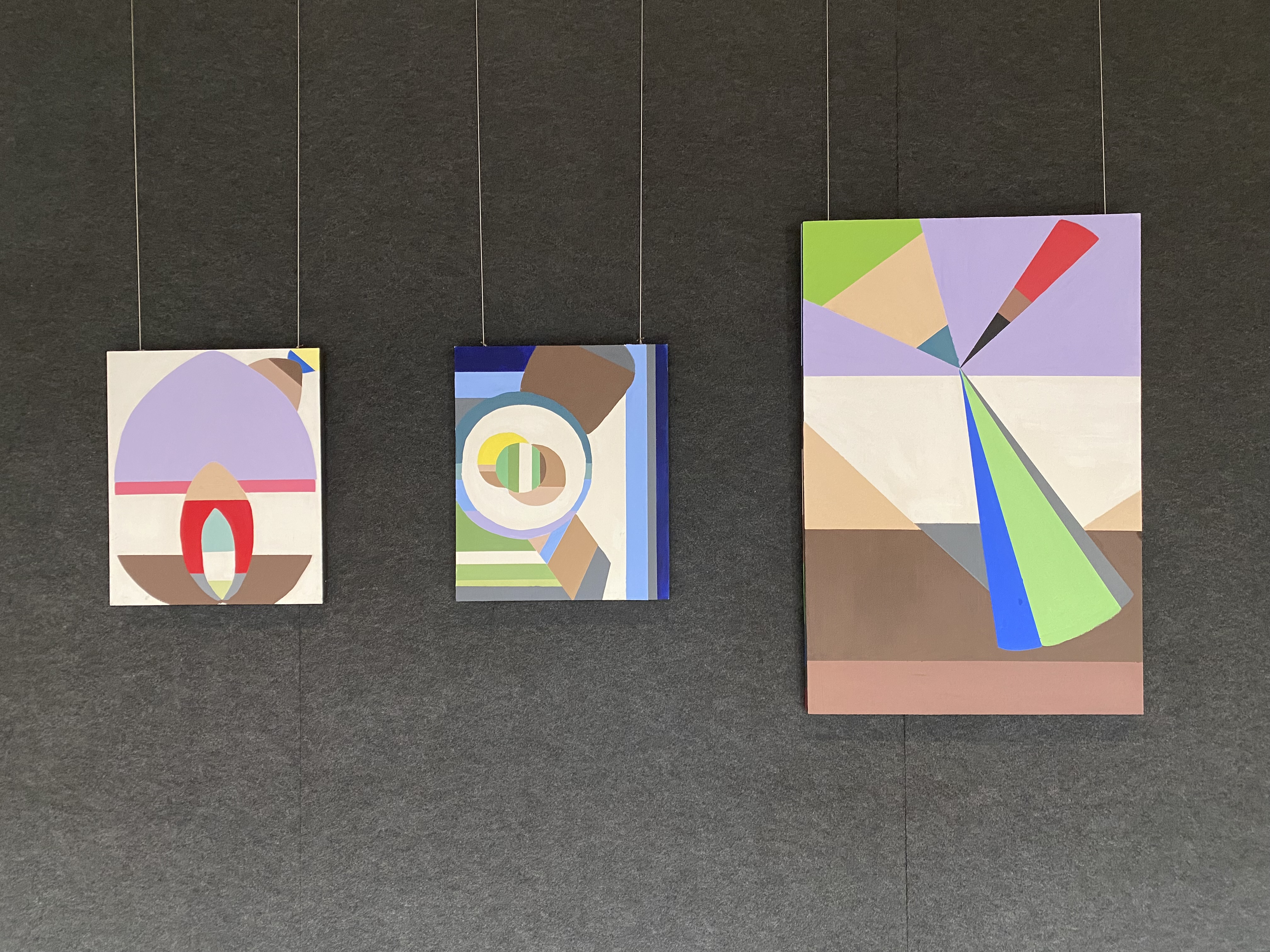
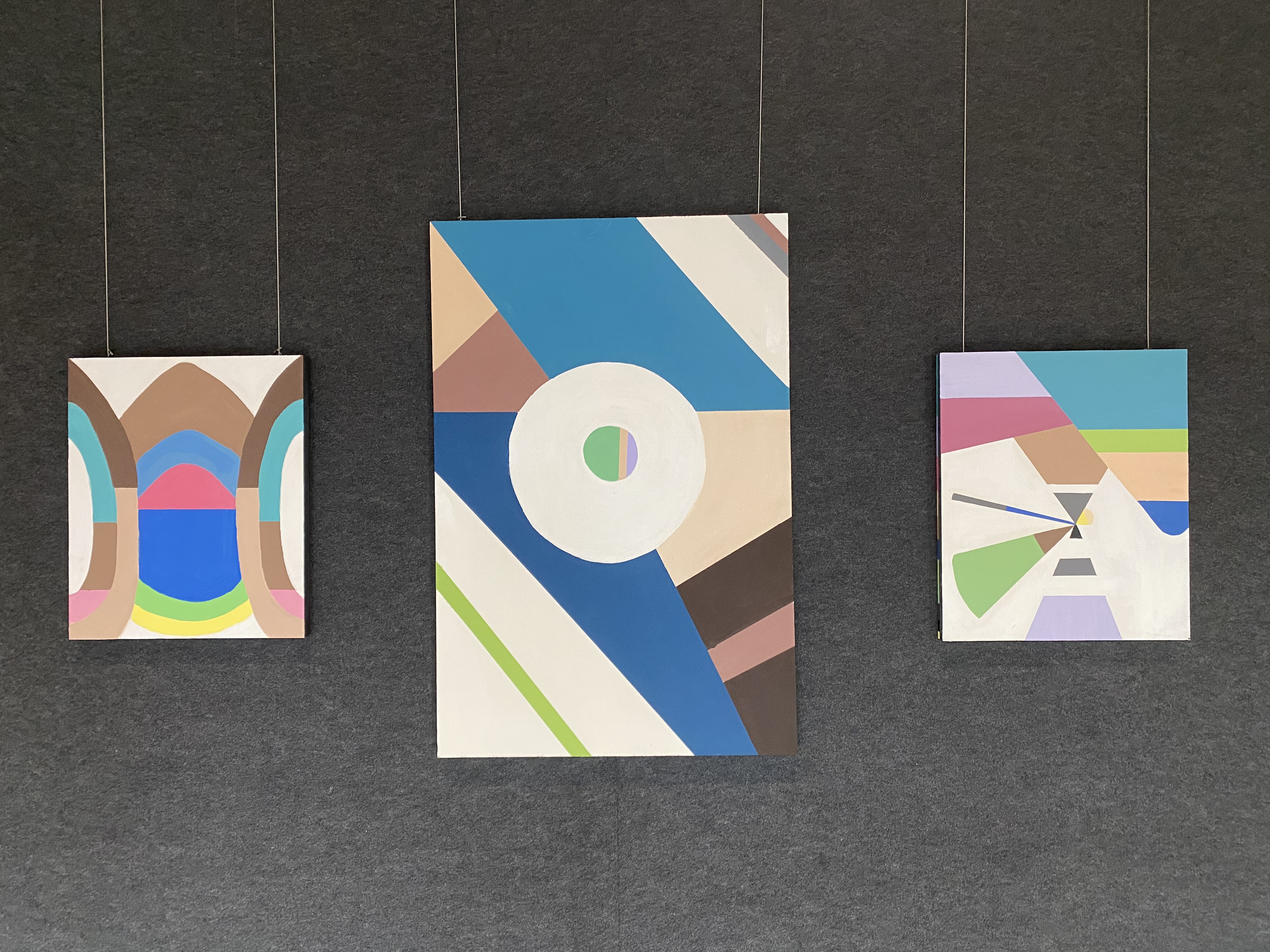
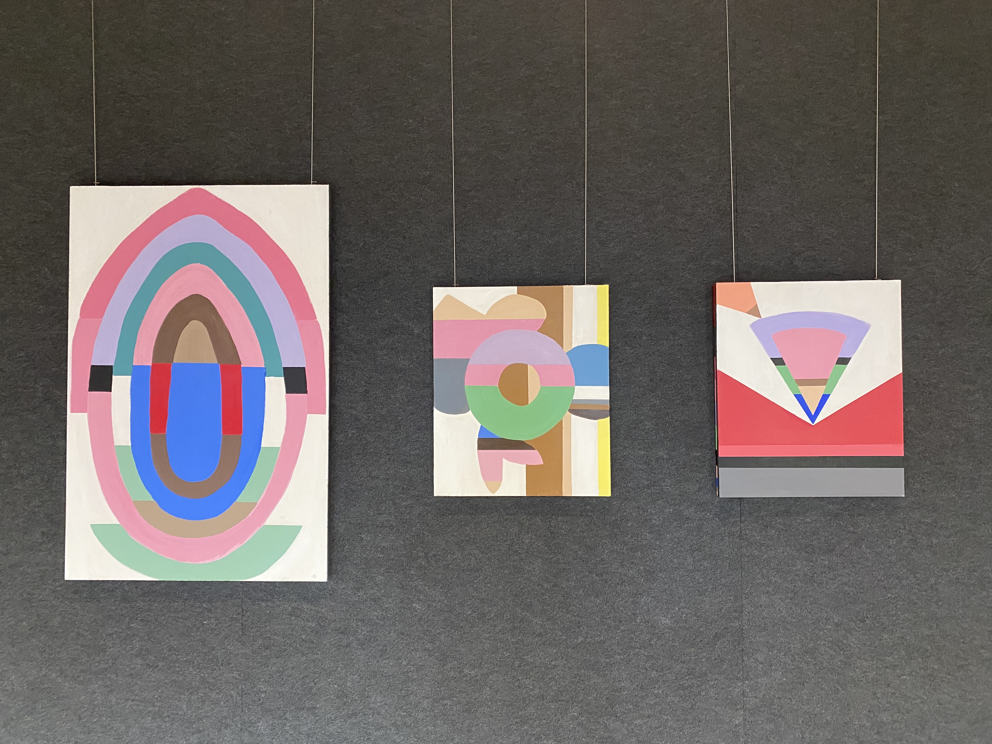
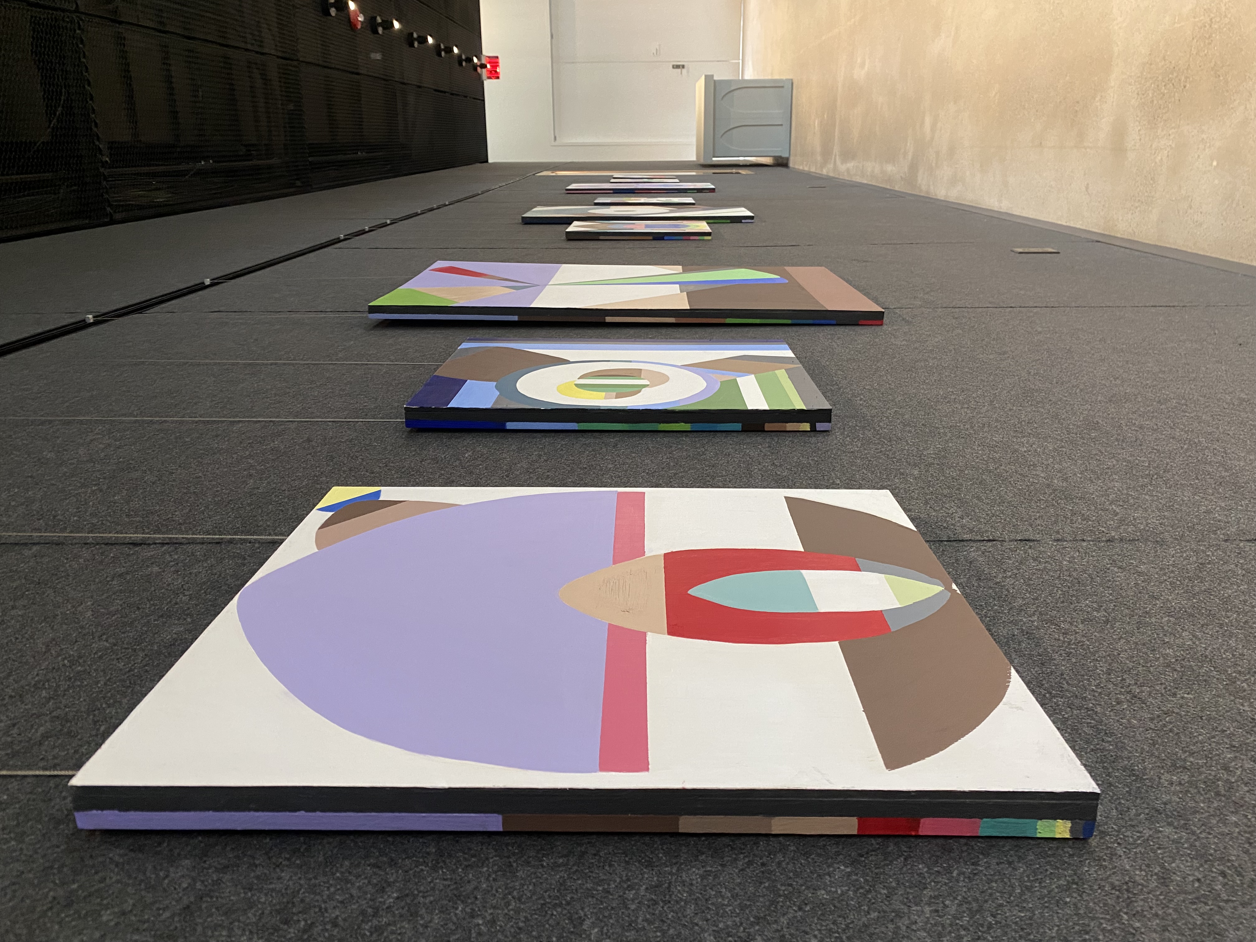
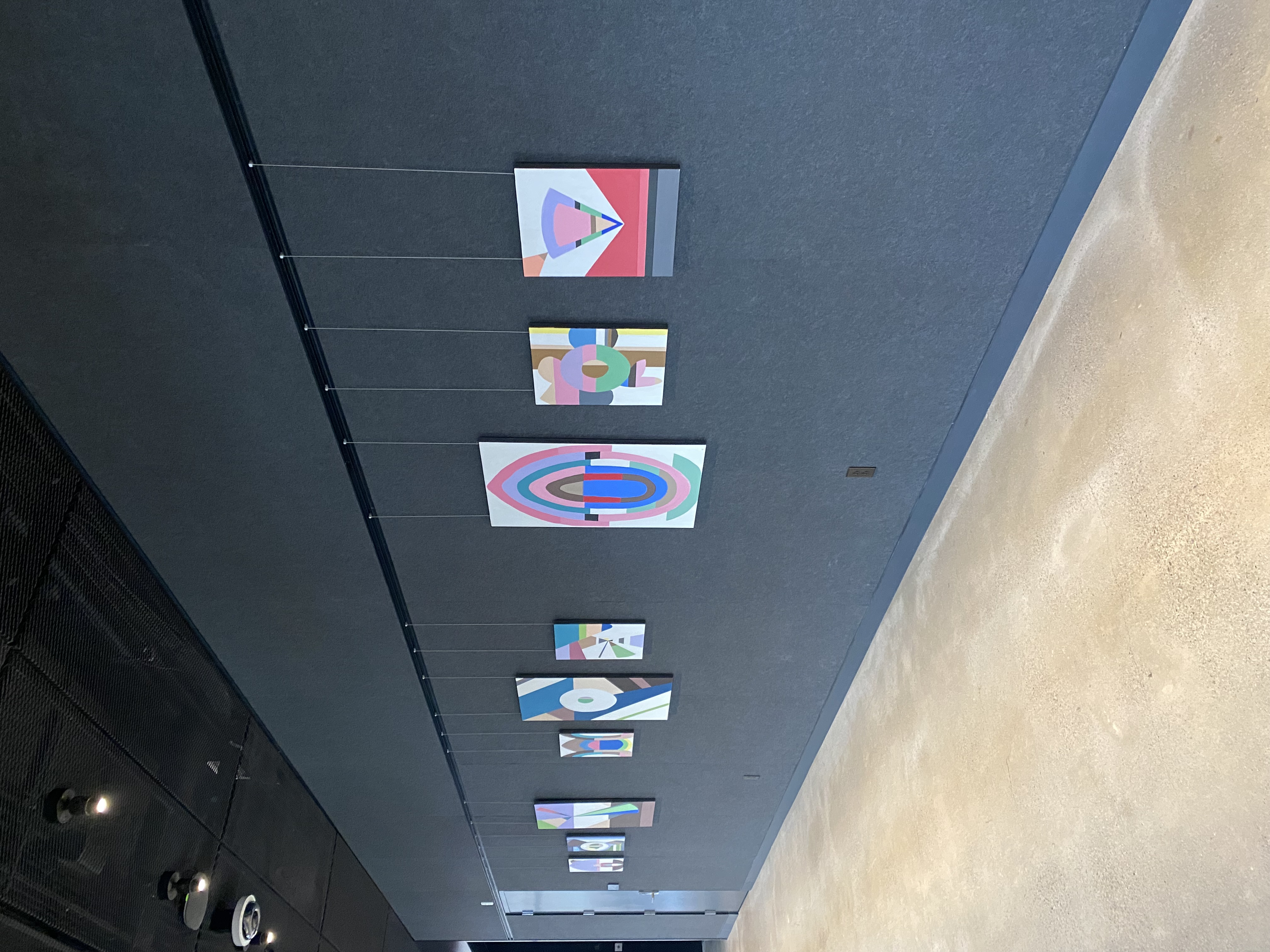
Constructing the Social Self: Painting with Data can be seen as a bridge between these two contexts. This series takes both the history of abstraction and modern-day data visualizations techniques and combines them into a single approach in order to explore the relationship between visual art and data.

Robert Delaunay (b. 1885, d. 1941), Circular Forms, 1930, Oil on canvas
Reddit Data Visualizations

Sources
Tuchman, Maurice. “Hidden Meanings in Abstract Art.” Essay. In The Spiritual in Art - Abstract Painting 1890-1985. Abbeville Press, 1986.

"Robert Delaunay.” The Guggenheim Museums and Foundation. Accessed May 2nd, 2023. https://www.guggenheim.org/artwork/artist/robert-delaunay.

Process

Creating the Social Self

Discover the details of how Constructing the Social Self came together.

Collection icon

Data Collection

The data for this study was gained through downloading my personal data sets generated from information collected by social media platforms I use. Reflecting on the power of modern social media, I wanted to explore the degree to which I was being monitored and categorized through my usage of different applications. To collect these sets, I used my account settings to request my individualized data reports, which were sent as a folder to my associated email account. I choose to download these records from four main sources: Google, Instagram, Snapchat, and Apple. I selected these platforms due to my frequent use of them which I believed would make them possess the most relevant and abundant information to work with. This grouping also spans a good range of what I would typically do on the internet, such as message friends, post pictures, and search the web. Overall, the extensive data collection I ended up with caused a deep realization of how essentially every single one of my digital actions is being tracked, and in turn how those documentations are being used to alter my experiences within these applications. Categories of data that I observed covered where I was, who I interacted with, how I interacted with different application features, my time on the app as well as how my activity placed me into certain categories or stereotypes.

Selection icon

Data Selection

As I sorted through the thorough reports, three main categories of interest emerged: location data, breakdowns of how I was using these applications, and statistics of me interacting with other accounts. I was intrigued by these groupings because each tackled a different aspect of myself being captured by the data, and overall they could provide a good analysis of how applications attempt to build comprehensive portraits of users. Snapchat revealed itself as having the most extensive geographical records so I opted to use that data as my main factor in the location visualizations. I utilized the latitudinal and longitudinal data points to construct the forms of this series and pulled names of locations Snapchat saved about my activity as the keywords for the color palettes. Snapchat also proved to be valuable in providing data in my activity series, which focused on how I was using the applications. I took the percentage breakdown of what I was doing on the app, such as using the camera or messaging friends, as the numerical data for the structures and identifying words the application used for me, such as “Female” or “21 years old”, for the color palettes. Finally, I used a mixture of Instagram and Apple data on my interactions with other individuals through social media for my connections series. For numerical data points I used my average like and comment counts for Instagram posts as well as the number of notifications I had on average from social media or texting. For the color palettes, I used the information my iPhone had to describe and categorize me, such as “iPhone 11” and “Verizon”.

Code icon

Digital

My visualization process entailed two different digital aspects: coding and graphing. The coding element of the project establishes itself through my usage of a program designed to generate color palettes. One aspect of this study was to explore how technology and artificial data attempt to define an individual. Therefore, by using this code, this idea can be explored further than the data sets alone through directly seeing how a computer would interpret the data keywords and attempt to visually display them. This feature is achieved through the code taking in a word established by the user and pulling down the top four images off of the Bing search engine associated with that phrase. It then generates a combined, comprehensive color palette of all four images of the word into one overlapping bar chart. This process allowed me to gain quick insight into how technology may perceive me solely based on these data reports it gathers on me and how I can utilize this information in my reclamations of the data. The second digital aspect of my technique is using Google Sheets to study typical ways of visualizing data and using them as inspiration for my new interpretations. As discussed in the Data Selection section, I would gather numerical data for each of my pieces. This information would then be inserted into a spreadsheet where I then could sort through various types of graphs to see general representations of the information. This imagery inspired me in my process by providing the general shapes of the works, such as using forms from radar charts, sections of maps and pie charts.

Paint icon

Painting

Following the digital processes, I brought my visualizations into the physical world through combining the computerized data representations and hex code colors into a singular composition. I began this development by first creating small marker studies on paper to sketch out my ideas for the final works. It was during this time I selected the forms or shapes I wanted to highlight in my pieces and figured out how I wanted to incorporate color into the composition. I decided to keep the banded look of hues as a pattern for the colors in order to reflect the nature of the code output. For translating my new unique visualizations, I wanted to paint them in the way of hard-edge abstraction to represent a minimalist, digital effect. To achieve this, I constructed gessoed masonite panels which were later sanded to give the painting a smooth, flat surface. Then, I worked with heavy body acrylic paint which would allow me to achieve opaque color and clean edges. The orderly form and geometrical essence of the compositions allow the paintings to communicate a computerized feel while also referencing a history of artistic representations of abstract imagery. As a grouping they communicate to one another through a shared visual language of geometry, color, and form.

Gallery

Explore the Visualizations

Click on each image to learn more about each individual piece.

Location Series: One

Location Series: Two

Location Series: Three

Activity Series: One

Activity Series: Two

Activity Series: Three

Connection Series: One

Connection Series: Two

Connection Series: Three


Installation Views

The Social Self Display in the Prior Performing Arts Center

Constructing the Social Self is displayed in the Prior Peforming Arts Center on the third floor outside of the Cantor Gallery. The exhibition is shown as three distinct groupings of work which have one painting from each of the three series. In this form, each grouping assumes itself as an individual data portrait of myself by combining the different collections I found in my reports. Overall, they also function as a wider, comprehensive self-portrait as well. Each painting references the data it is made from by including a color inventory on the left side of the painting.

Further Exploration

Uncover Your Own Social Self

Use the information and links below to learn more about Constructing the Social Self and how you can create your own Social Self visualizations.

  1. Download data reports from your social media accounts of choice.
  2. Select which data keywords you would like to use for the color aspect of your imagery. For examples, follow the link for Image Source and Palette Generator Code.
  3. Input your data keywords into the code to see your color palette options. Select which colors best represent you.
  4. Select which data points you would like to use for your Google Sheets data. For examples, follow the link to the General Visualization Data Sheet .
  5. Embrace your creative freedom to combine your chosen code colors and visualizations into personalized reclamations of your recorded data.
Your message was sent, thank you!